
Summary
Data visualisation is an essential part of the communication process. 23 Exabytes of information was recorded and replicated in 2002. We now record and transfer that much information every 7 days. Data is a measurement of quantity or quantitative variables that provide information. Data visualisation is the modern visualisation representation of data that has been abstracted for the units of information. Infographics are not all based on data but all data visualisations are based on data. Infographics can communicate a process of something, not all include data. Effective visualisation helped users to reason about evidence, makes the data more understanding and may help making comparisons which follows the task. Bar charts are the most popular for data visualisation but need more data to explore the situation. Line charts are also efficient for time oriented data as they will be able to read and will be understood when users need to explore them.
Important Aspect & Why
How much information we can process now will blow our minds but is important so we know that we can process even more in the future. Knowing the difference between data visualisation and infographics is important as we need to know as designers the easiest way to set out the information we are trying to communicate so the community will understand. We need to know what visualisation is effective and what it can communicate. The types of charts are important for designers to understand so we know what form of chart to use to store the information we want to portray. We need to gather as much information about the situation as possible to make sure we are communicating enough data in the data visualisation.


Image References
What’s your political typology? [Image] (2016). Retrieved 24h July 2016 from http://www.boostlabs.com/wp-content/uploads/2012/05/poltical_breakdown-825×1024.jpg
Data visualisation. [Image] (2016). Retrieved 24h July 2016 from http://www.boostlabs.com/wp-content/uploads/2012/11/data-visualization-680×675.jpg
Predictive analytics. [Image] (2016). Retrieved 24h July 2016 from http://prescio.com/wp-content/uploads/2015/02/predictive-analytics.png
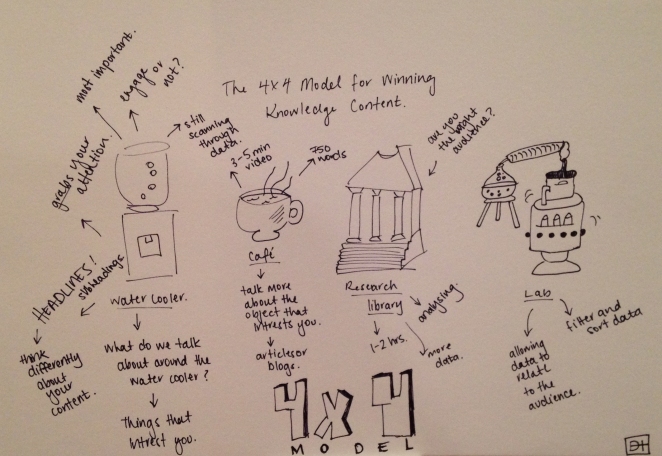
The 4X4 Model for Winning Knowledge Content
Summary Graphics
4X4 Model
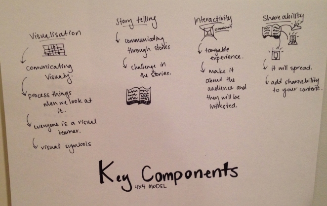
Key Components
