Lecture Pod #6 – Beautiful Visualization.

Summary

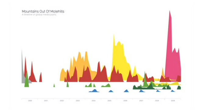
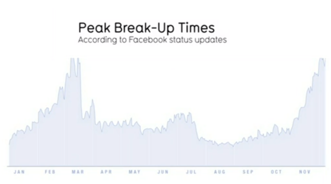
We are all suffering from information overload and there might be an easy solution to this. Using our eyes more. Visualising the data and designing the data that is important. By visualising data you can turn it into a landscape or a map to see with your eyes. When you’re lost in information, an information map is useful. Data is the new oil, it is a resource that we can shape to find new insights as it is all around us. It is not a great metaphor, so if we were to change it to data is the new soil, as it is a fertile creative medium. We irrigate large amounts of data with creativity and its been worked by unpaid government workers as its a fertile medium. Visualisations feel as if they are flowers, blooming from this medium. If you work with it in a way, different patterns and meanings can be told from the data. If you ask the right question, interesting things can emerge. If you combine the language of the eye, with the language of the mind it is more than just words, numbers and concepts, you then start to speak two languages, each enhancing the other. We can use this new language to alter our views. To be fair, we need to compare similar data sets to see a fuller picture that can lead to us changing our perspective. Visualisations are a form of knowledge compression, squeezing as much information into a small space. Visualisations can also be a form of ideas and concepts, so we can see what others thinking and where they are coming from.

screen-shot-2016-10-17-at-8-51-08-pm

screen-shot-2016-10-17-at-8-57-57-pm

Important Aspect & Why

As designers, we need to understand that design is about solving problems and producing solutions. Information design is about solving information problems as have a lot of information in our society from the overload, trust and reliability and lack of transparency. We need to create information that has a magnetic quality so it draws the viewers in.

Image References

Mountains out of molehills. [Image] (2010). Retrieved 17th October 2016 from http://www.informationisbeautiful.net/visualizations/mountains-out-of-molehills/

Data is the new soil. [Image] (2010). Retrieved 17thOctober 2016 from http://www.ted.com/talks/david_mccandless_the_beauty_of_data_visualization#t-401680

Peak break up times. [Image] (2010). Retrieved 17th October 2016 from http://www.ted.com/talks/david_mccandless_the_beauty_of_data_visualization#t-401680

Lecture Pod #1 – The communication process.

Summary

Data visualisation is an essential part of the communication process. 23 Exabytes of information was recorded and replicated in 2002. We now record and transfer that much information every 7 days. Data is a measurement of quantity or quantitative variables that provide information. Data visualisation is the modern visualisation representation of data that has been abstracted for the units of information. Infographics are not all based on data but all data visualisations are based on data. Infographics can communicate a process of something, not all include data. Effective visualisation helped users to reason about evidence, makes the data more understanding and may help making comparisons which follows the task. Bar charts are the most popular for data visualisation but need more data to explore the situation. Line charts are also efficient for time oriented data as they will be able to read and will be understood when users need to explore them.

Important Aspect & Why

How much information we can process now will blow our minds but is important so we know that we can process even more in the future. Knowing the difference between data visualisation and infographics is important as we need to know as designers the easiest way to set out the information we are trying to communicate so the community will understand. We need to know what visualisation is effective and what it can communicate. The types of charts are important for designers to understand so we know what form of chart to use to store the information we want to portray. We need to gather as much information about the situation as possible to make sure we are communicating enough data in the data visualisation.


Image References

What’s your political typology? [Image] (2016). Retrieved 24h July 2016 from http://www.boostlabs.com/wp-content/uploads/2012/05/poltical_breakdown-825×1024.jpg

 Data visualisation. [Image] (2016). Retrieved 24h July 2016 from http://www.boostlabs.com/wp-content/uploads/2012/11/data-visualization-680×675.jpg

Predictive analytics. [Image] (2016). Retrieved 24h July 2016 from http://prescio.com/wp-content/uploads/2015/02/predictive-analytics.png


The 4X4 Model for Winning Knowledge Content

Summary Graphics

IMG_0099

4X4 Model

IMG_0100

Key Components